When I teach my analytics workshop a common question I get asked is “how do I improve my conversion rate?”. The thing is, that questions is answered with another question: how do you know if there is room for improvement?
And the answer to this one has me talking about the law of diminishing returns, which is a concept widely used in economics and shows the relationship between investment (time, money, resources) and benefits.
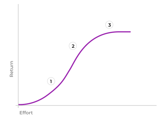
The law of diminishing returns
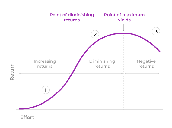
How do you read this curve?
- Section 1: is the fastest growing part of the curve, which means that efforts invested provide a more than proportional return.
- Section 2: along this part of the curve we still see returns on our investment, and will keep decreasing as we approach section 3, as the curve becomes less and less steep.
- Section 3: here the slope starts to go down, meaning that our efforts stop having positive returns. This means it doesn’t make sense to keep investing (effort, resources, etc.).
For Designers, UXers and Product Owners/Managers is key to understand how the law of diminishing returns works because it helps them make appropriate design, product and business decisions.
Some examples
The law of diminishing returns and its graph should be familiar to most because is the same we use to explain why 5–8 users are enough to test an interface, and is also the same that is used to display SUS (System Usability Scale) results.
Example 1: Why testing with 5–8 users is enough?
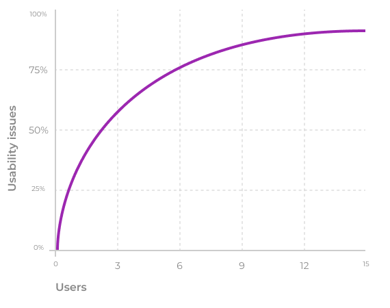
This chart uses sections 1 and 2 of the curve we saw earlier and shows that the first 5–8 users are enough to discover 80% of usability problems of a system.
The first user provides a lot of information, the second one still does but not as much as the first one, and so on until we reach the 5th or 6th user. After that, the curve starts to flatten, which means that the amount of new information that each additional user provides diminishes with each new one.
The take away is that interviewing additional users after the 5th — 8th is a waste of resources (recruiting efforts, interview time, team, incentives, etc.).
SUS (System Usability Scale)
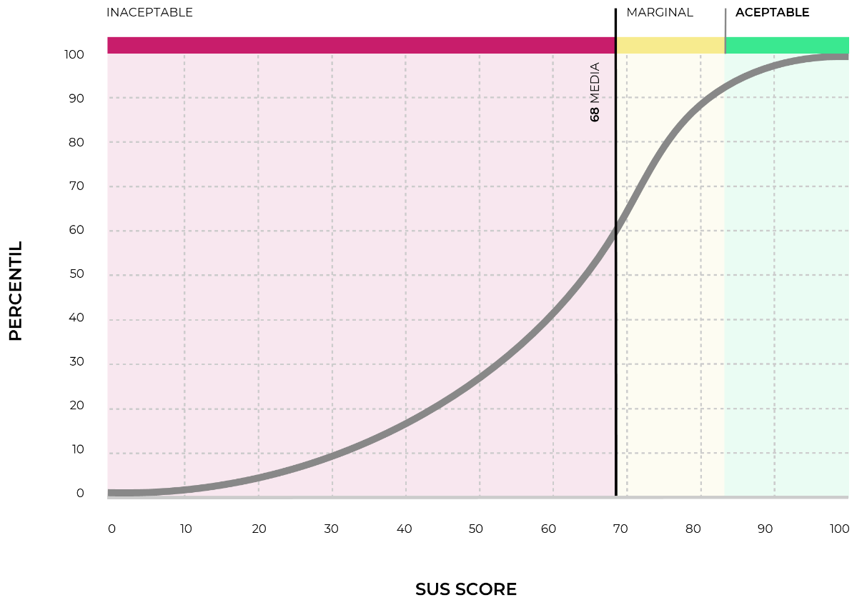
The SUS, or System Usability Scale measures the usability of a system, and reports its results using the curve of diminishing returns in its entirety:
- The red zone (unacceptable level of usability) corresponds with section 1 of the curve, which means that if the usability of our interface falls somewhere here we have lots of room for improvement. Or, from the point of view of the law of diminishing returns, it is worth improving the usability because these efforts will generate a return more than proportional to the investment.
- The yellow zone (acceptable level of usability) matches section 2 and shows that the severity of the issues is not as critical in this area. So depending on the problems found, we can prioritize and choose which ones to work on. This prioritization can be made using the qualitative data, since it will tell us which are more critical from a user experience point of view.
- The green zone corresponds to section 3. A SUS score in this area means that the issues found are not critical. And it is likely that the cost of making those improvements will be hither that the return we will obtain. Unless they are merely cosmetic and can be fixed with a few hours of design or development.
So… how do we know if there is room for improving the conversion rate?
Let’s suppose that the current online conversion rate is 30%. How do we know if there is room to improve this or if it is the maximum we can expect given the existing conditions?
To answer this question we need to identify in which part of the curve is located this 30%. And the only way of doing this is by doing user research.
During research we will collect information regarding:
- General aspects of the purchase process: why do users come to the site? Are they comparing prices, looking for product information or are they ready to buy? Are they comfortable making the purchase online or is it a ROPO type of purchase (research online purchase offline)? What other channels and websites are they also looking at?
- Specific aspects of our site: do they find the information they need to make a purchase decision? Does brand perception impacts the purchase decision (we have found that sometimes a negative brand perception causes users to come to the site for information only, but prefer to buy elsewhere). Are there usability issues that keep users from finalizing the purchase?
With this information we’ll be able to place our 30% conversion rate along the curve. And depending on where we are we’ll know whether it makes sense to invest efforts. And if so, we’ll know how to go about it based on the research results.
If we are in 1, we probably found, during research, critical issues that limit the conversion rate. Therefore, investing in improving those issues will generate a return higher than the cost, so it makes sense to go ahead.
If we are in 2, we still have room to improve the conversion rate, but we need to make a more careful cost/benefit analysis of the work that needs to be done since the return on the investment starts to be lower as we make improvements. When doing that prioritization we need to take into account not just development cost and efforts, but also severity from a usability/user experience point of view. If you leave this out the benefit of the improvements will be severely affected.
If we are in 3, which is the highest slice of the curve we see that the 30% conversion is about the maximum we can aspire to given the current conditions. In this case, it is very likely that during user research you found minor issues that don’t affect conversion significantly.
In this case, unless each percentage point of conversion has a significant income value, it probably makes more sense to assign your resources to other projects.
In short: it is key to know where in the curve your problem lies so you don’t invest effort into something that doesn’t make sense to optimize.
Other uses of this graph
The law of diminishing returns can be used in many other product or design decisions, such as:
- Backlog prioritization: once we know where in the curve our problem is, it is easy to prioritize efforts based on the ROI of each item.
- Evaluate and prioritize design and development efforts: during user research we’ll be able to understand how severely each of the issues found affect product performance. And this will give us the necessary information to make a cost/benefit analysis based on which part of the curve is the overall performance.
- Assign resources: once we know how critical an issue is, we’ll know whether it makes sense to assign resources to a project, based on the logic of the law of diminishing returns.
When I teach my analytics workshop a common question I get asked is “how do I improve my conversion rate?”. The thing is, that questions is answered with another question: how do you know if there is room for improvement?
And the answer to this one has me talking about the law of diminishing returns, which is a concept widely used in economics and shows the relationship between investment (time, money, resources) and benefits.
The law of diminishing returns
How do you read this curve?
- Section 1: is the fastest growing part of the curve, which means that efforts invested provide a more than proportional return.
- Section 2: along this part of the curve we still see returns on our investment, and will keep decreasing as we approach section 3, as the curve becomes less and less steep.
- Section 3: here the slope starts to go down, meaning that our efforts stop having positive returns. This means it doesn’t make sense to keep investing (effort, resources, etc.).
For Designers, UXers and Product Owners/Managers is key to understand how the law of diminishing returns works because it helps them make appropriate design, product and business decisions.
Some examples
The law of diminishing returns and its graph should be familiar to most because is the same we use to explain why 5–8 users are enough to test an interface, and is also the same that is used to display SUS (System Usability Scale) results.
Example 1: Why testing with 5–8 users is enough?
This chart uses sections 1 and 2 of the curve we saw earlier and shows that the first 5–8 users are enough to discover 80% of usability problems of a system.
The first user provides a lot of information, the second one still does but not as much as the first one, and so on until we reach the 5th or 6th user. After that, the curve starts to flatten, which means that the amount of new information that each additional user provides diminishes with each new one.
The take away is that interviewing additional users after the 5th — 8th is a waste of resources (recruiting efforts, interview time, team, incentives, etc.).
SUS (System Usability Scale)
The SUS, or System Usability Scale measures the usability of a system, and reports its results using the curve of diminishing returns in its entirety:
- The red zone (unacceptable level of usability) corresponds with section 1 of the curve, which means that if the usability of our interface falls somewhere here we have lots of room for improvement. Or, from the point of view of the law of diminishing returns, it is worth improving the usability because these efforts will generate a return more than proportional to the investment.
- The yellow zone (acceptable level of usability) matches section 2 and shows that the severity of the issues is not as critical in this area. So depending on the problems found, we can prioritize and choose which ones to work on. This prioritization can be made using the qualitative data, since it will tell us which are more critical from a user experience point of view.
- The green zone corresponds to section 3. A SUS score in this area means that the issues found are not critical. And it is likely that the cost of making those improvements will be hither that the return we will obtain. Unless they are merely cosmetic and can be fixed with a few hours of design or development.
So… how do we know if there is room for improving the conversion rate?
Let’s suppose that the current online conversion rate is 30%. How do we know if there is room to improve this or if it is the maximum we can expect given the existing conditions?
To answer this question we need to identify in which part of the curve is located this 30%. And the only way of doing this is by doing user research.
During research we will collect information regarding:
- General aspects of the purchase process: why do users come to the site? Are they comparing prices, looking for product information or are they ready to buy? Are they comfortable making the purchase online or is it a ROPO type of purchase (research online purchase offline)? What other channels and websites are they also looking at?
- Specific aspects of our site: do they find the information they need to make a purchase decision? Does brand perception impacts the purchase decision (we have found that sometimes a negative brand perception causes users to come to the site for information only, but prefer to buy elsewhere). Are there usability issues that keep users from finalizing the purchase?
With this information we’ll be able to place our 30% conversion rate along the curve. And depending on where we are we’ll know whether it makes sense to invest efforts. And if so, we’ll know how to go about it based on the research results.
If we are in 1, we probably found, during research, critical issues that limit the conversion rate. Therefore, investing in improving those issues will generate a return higher than the cost, so it makes sense to go ahead.
If we are in 2, we still have room to improve the conversion rate, but we need to make a more careful cost/benefit analysis of the work that needs to be done since the return on the investment starts to be lower as we make improvements. When doing that prioritization we need to take into account not just development cost and efforts, but also severity from a usability/user experience point of view. If you leave this out the benefit of the improvements will be severely affected.
If we are in 3, which is the highest slice of the curve we see that the 30% conversion is about the maximum we can aspire to given the current conditions. In this case, it is very likely that during user research you found minor issues that don’t affect conversion significantly.
In this case, unless each percentage point of conversion has a significant income value, it probably makes more sense to assign your resources to other projects.
In short: it is key to know where in the curve your problem lies so you don’t invest effort into something that doesn’t make sense to optimize.
Other uses of this graph
The law of diminishing returns can be used in many other product or design decisions, such as:
- Backlog prioritization: once we know where in the curve our problem is, it is easy to prioritize efforts based on the ROI of each item.
- Evaluate and prioritize design and development efforts: during user research we’ll be able to understand how severely each of the issues found affect product performance. And this will give us the necessary information to make a cost/benefit analysis based on which part of the curve is the overall performance.
- Assign resources: once we know how critical an issue is, we’ll know whether it makes sense to assign resources to a project, based on the logic of the law of diminishing returns.